A refined Advent
How embossed foil printing and cold foil transfer produce a high-quality calendar
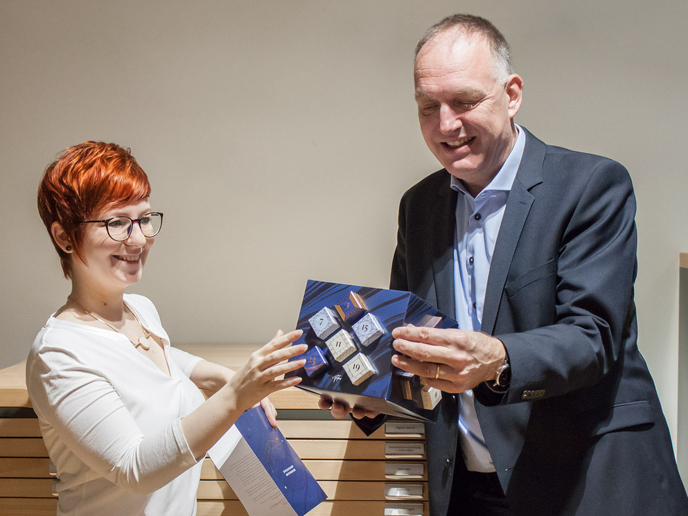
Christmas spirit doesn't just start on the first Sunday in Advent. So it's even nicer when you already have a high-quality Advent calendar on the table, which impresses, not only thanks to its refined contents, but also its refined look and feel: the GRÄFE Group Advent calendar is a successful interplay of well-considered design and professional implementation. It was produced on a base material of Algro Design paperboard from Sappi, using cold foil transfer and embossed foil printing as a finishing process. Frank Denninghoff, Managing Director of GRÄFE Druckveredelung, and Deborah Taranto, Creative Director at GRÄFE Atelier, explain the approach.
Finishing is also a creative process
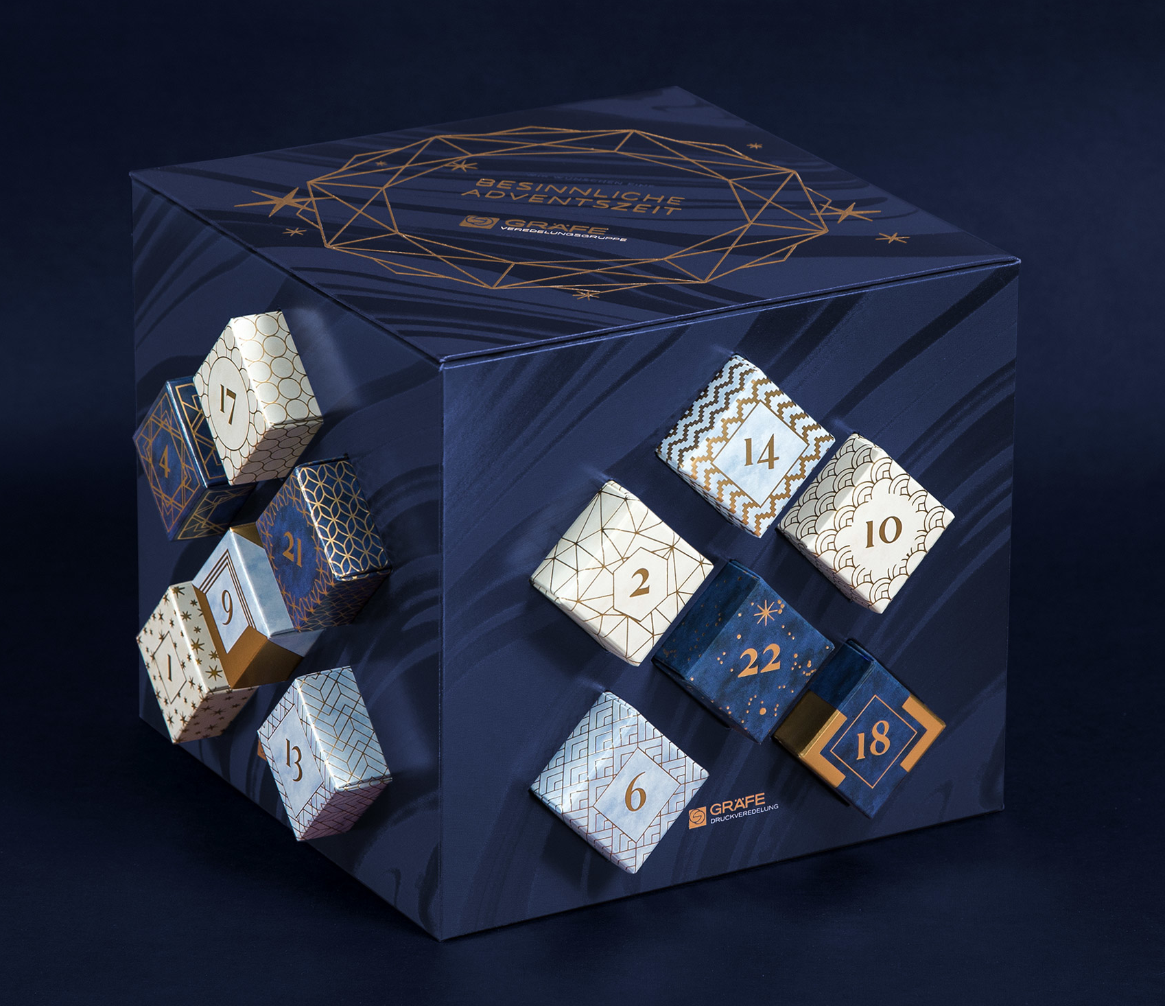
For the Bielefeld-based company, print finishing relies on far more than just the technical aspects, it is also a creative process. This is the central philosophy of GRÄFE Atelier, which originates from the in-house advertising agency Idee & System. The creative processes of branding, design and prepress within the GRÄFE Group, as well as joint projects with Sappi have been taking shape here for a long time already. The two companies are linked by a long-standing partnership characterized by their love of high-quality print products. Deborah Taranto sums it up: "Essentially, our focus is on branding in combination with finishing. We put our heart and soul into developing this Advent calendar. The new surface effects create haptic and optical stimuli that convey a specific brand message". Frank Denninghoff explains how this works: "It's about generating attention at first sight through targeted effects – for the viewer, it causes them to stop and look more closely, only for them to discover much more at second, third and fourth glance, thus address their motifs and goals in a multi-sensory way".
Understatement on Algro Design
But what's the best way to do that? "It's very important to know how finishes work together, so that you can combine them optimally", explains Frank Denninghoff. Understatement is the keyword: "In individual cases, it is important not to exaggerate – to make sure that certain messages are conveyed in a targeted and sensitive manner and that everything appears harmonious. Sappi offers the perfect substrate that makes such things possible. It is suitable for direct contact with foodstuffs, has a high degree of whiteness and also the capabilities of a solid bleached board, which is ideally suited for complex surface finishing. The cold foil transfer has a phenomenal effect on Algro Design and is perfect for reproductions. We've been enthusiastic users of the material for a long time".
Fine details, diverse structures
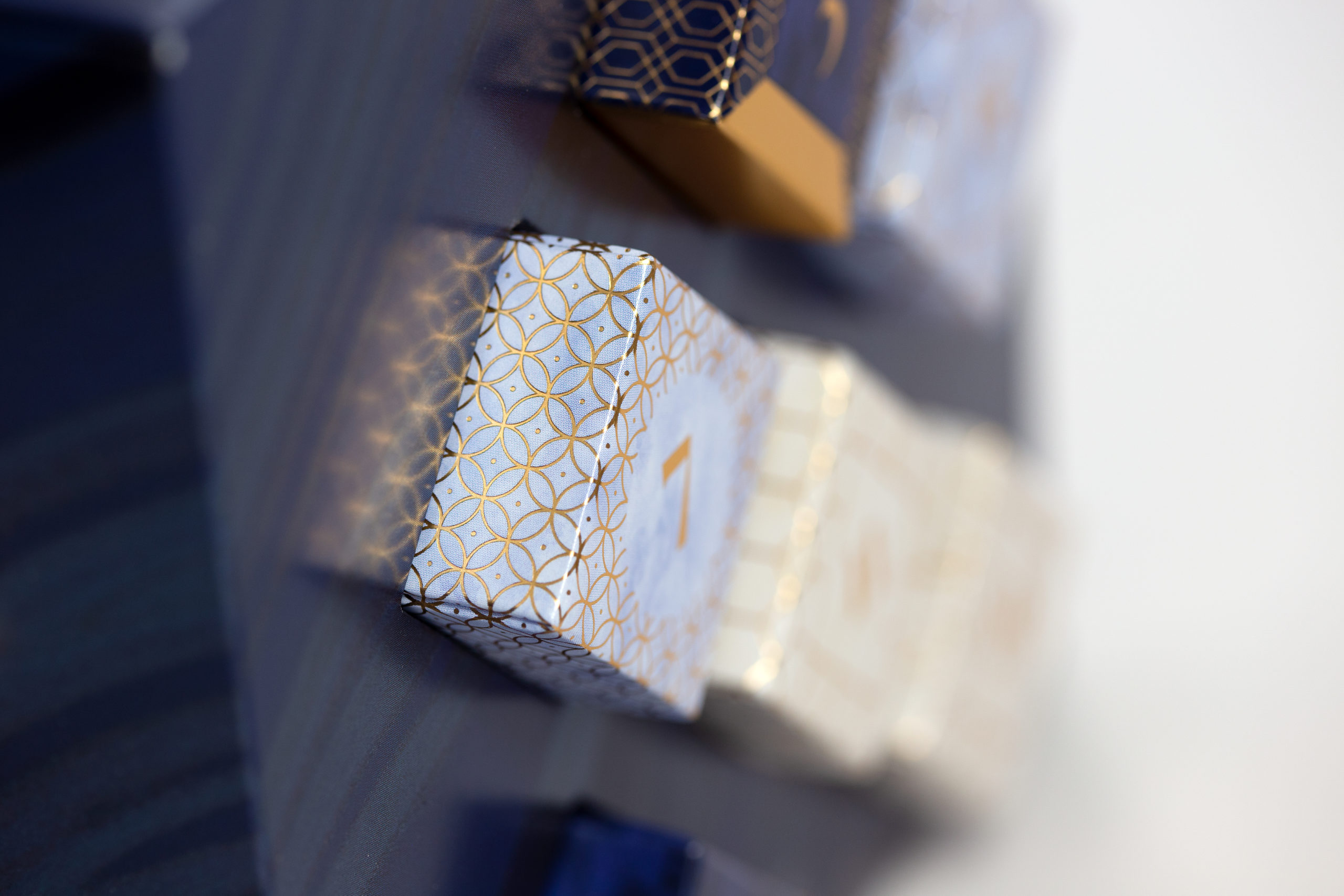
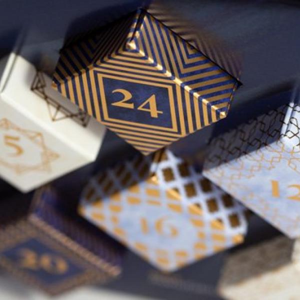
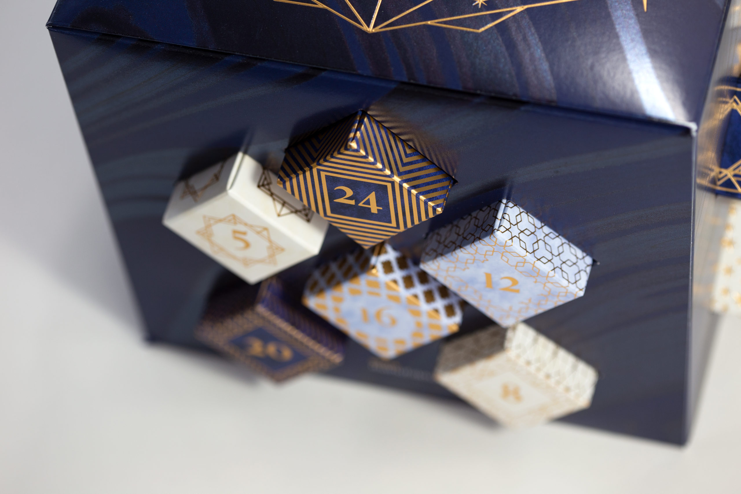
The results speak for themselves and you can really feel the difference. It's the many small details that make up the big picture. If you gradually open the small boxes, you discover the various surfaces with their consistent textures. "From a design point of view, the subject of diversity was particularly important to us. Every small gift, together with the surrounding boxes, captivates with its unique individuality", says Deborah Taranto, explaining the underlying concept. And it's true: when you take out the little parcels, the first thing you notice is that they are embossed all around. You can feel it with your fingers and can experience the diverse filigree structures via touch. The embossed foil printing finishing was carried out on a flat-bed machine to create a subtle yet noticeable texture. Secondly, the boxes are not glued but folded and have an additional gold PET lamination, which gives them a particularly sophisticated look.
Cold foil effects with optimum economic efficiency
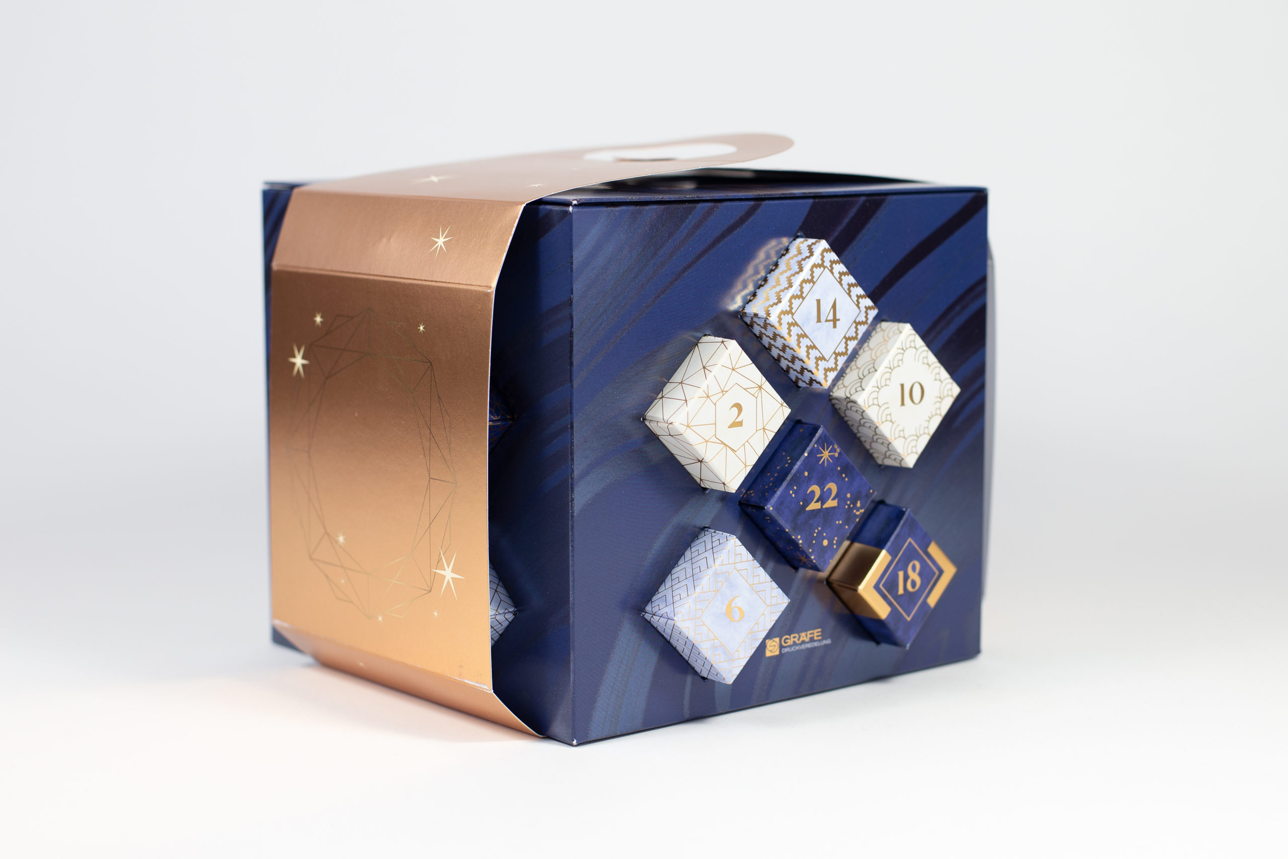
Although the body and the banderole around it are finished using cold foil transfer, the process discreetly takes a back seat. Frank Denninghoff explains why: "We decided to keep it 'low profile' and only used a cold foil marbling on the outer surface of the decoration. It was a matter of implementing these effects in an economical way while making sure that it did not appear overloaded – because that detracts from the 'wow' effect". During cold foil transfer, for example, the transferred metallic transfer layer was precisely overprinted inline – at GRÄFE, four colours plus gloss finish are possible in a single operation. The trick is to use flatness, strokes and dots as well as the triple colouring dark blue, beige and light blue to lend the overall appearance a restrained sense of depth. This is thematically reinforced by the accompanying Christmas card and the calendar and of course, the most important thing: the chocolates inside, which are all very tasty!
